June 2018 Release: Enhanced UX, Faster Approvals & Side by Side View

It’s our goal to make our users happy by eliminating clutter, not only from your desks, but also from our product. That’s why we’re making ApprovalMax even easier to use, for both web and mobile devices alike.
We’ve focused on that in our recent update, as well as on some much awaited new features. And in this blog post, we’re going to explain just what our June 2018 release has in store.
Enhanced User Experience
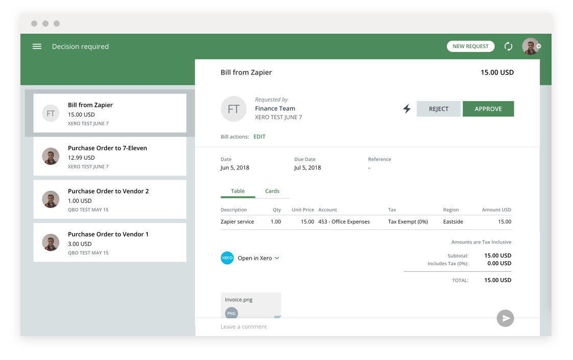
First, we enhanced user experience by changing the way Purchase Orders and Bills look, making them more intuitive, without the distractions of unnecessary details.
We then redesigned the approval request form to make it clearer and more user-friendly. The most critical data (Fields, Line Items) is now shown first. This means no clutter, with information blocks (Line Items, Matching, Workflow, Audit Trail, etc.) clearly separated and with the same style.

Faster Approvals
With this update, approvals will take less time. Now, ApprovalMax won’t have to wait for the system’s reply in such circumstances where you, for example, have several attachments to process. Instead, the system will count your decision (approved / rejected) immediately, allowing you to move to the next step, while dealing with the rest in the background.
In other words, we’ve sped-up the approval decision with a clever animation, allowing the approver to switch to the next request right away.
Side-by-side view
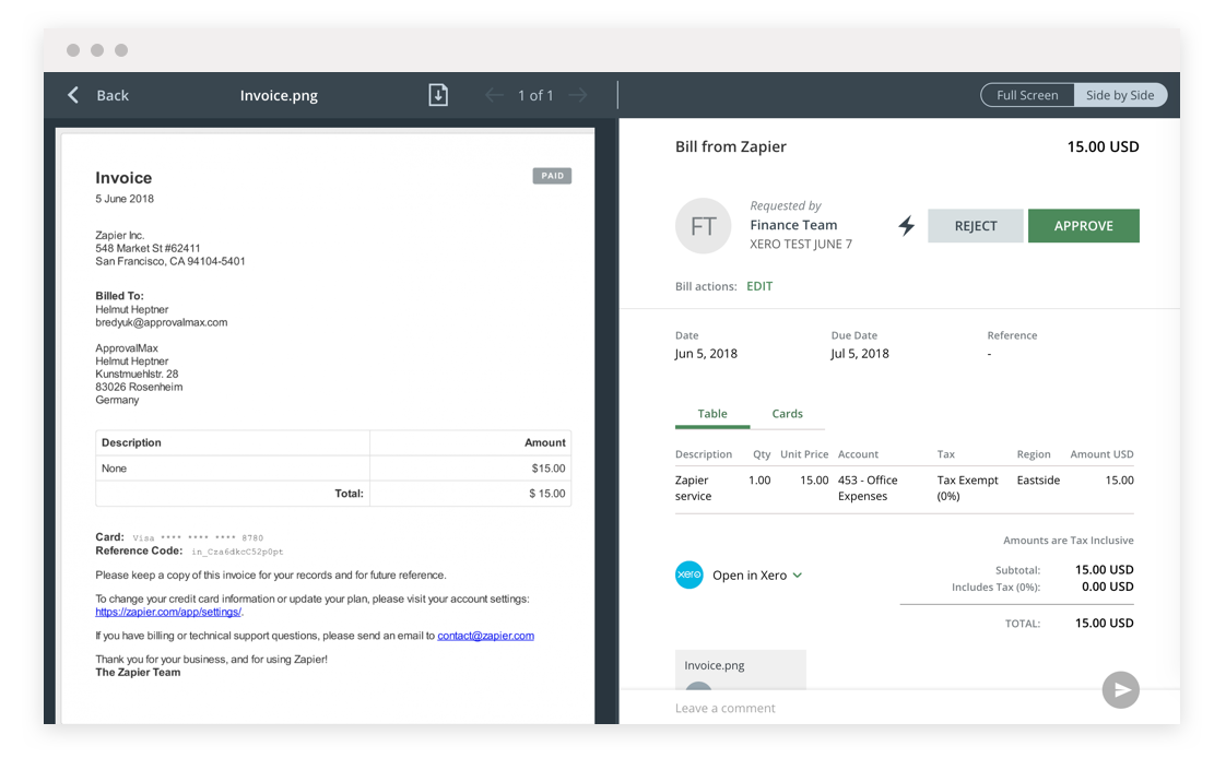
A very popular feature request, a side-by-side review of invoices and invoice data entry is now live! It means that you’ll be able to see the original invoice and its digital version together on one screen – please see the screenshot below for an idea of how it looks.
This will allow you to reduce the time spent reviewing documents, while vastly improving your user experience as you won’t need to constantly switch between different tabs or screens.

Other New Features
We’ve also added the following feature enhancements to ApprovalMax this month:
- “Copy”, “Start over” and other actions are now more visible. They’re shown on the form itself instead of being hidden behind the “Three dots menu”. What’s more, improved “Start over” dialog means the most relevant fields are shown to distinguish requests easily.

- The “Approving on behalf of” message is now shown if a user approves a decision as a delegate of another user.

- The Up and Down keys on the keyboard now work in the list of requests, switching requests in a similar fashion to, say, emails in Microsoft Outlook.
- New fields in Reports: Net Amount, Tax Amount.
- Creation Date and Decision Date in Reports now have both Date and Time displayed.
And that’s June’s release in a nutshell! Stay tuned to our newsletter for more news and updates.
If your company is not yet benefiting from ApprovalMax, find out more about the platform and its other capabilities by clicking here. Or if you’d like to try it out, sign up for your no-risk 30 day free trial here.

